Janet Street Porter’s curated Open House Festival collection
For the Open House Festival’s 30th anniversary, we have brought on three different Londoners to work on the programming of the festival. Janet Street Porter, Harriet Thorpe and Shahed Saleem have work worked with the festival team each curating a collection. These collections are their chance to share with others the buildings and places they see as being worthy of celebrating and exploring.
Janet Street-Porter is a writer, broadcaster and former editor of the Independent on Sunday, but she originally studied architecture before starting her journalistic career in her early twenties, and then moving into television and radio as a presented and senior executive.
Her collection is bold and diverse, from a house she personally commissioned in 1996 designed by the world-famous architect David Adjaye, to a car showroom turned Tescos, and her witty, personal rational for each really brings it to life. Enjoy!
Click here to go to the programme.
1. 35 CLERKENWELL CLOSE, FOG HOUSE, DAVID ADJAYE
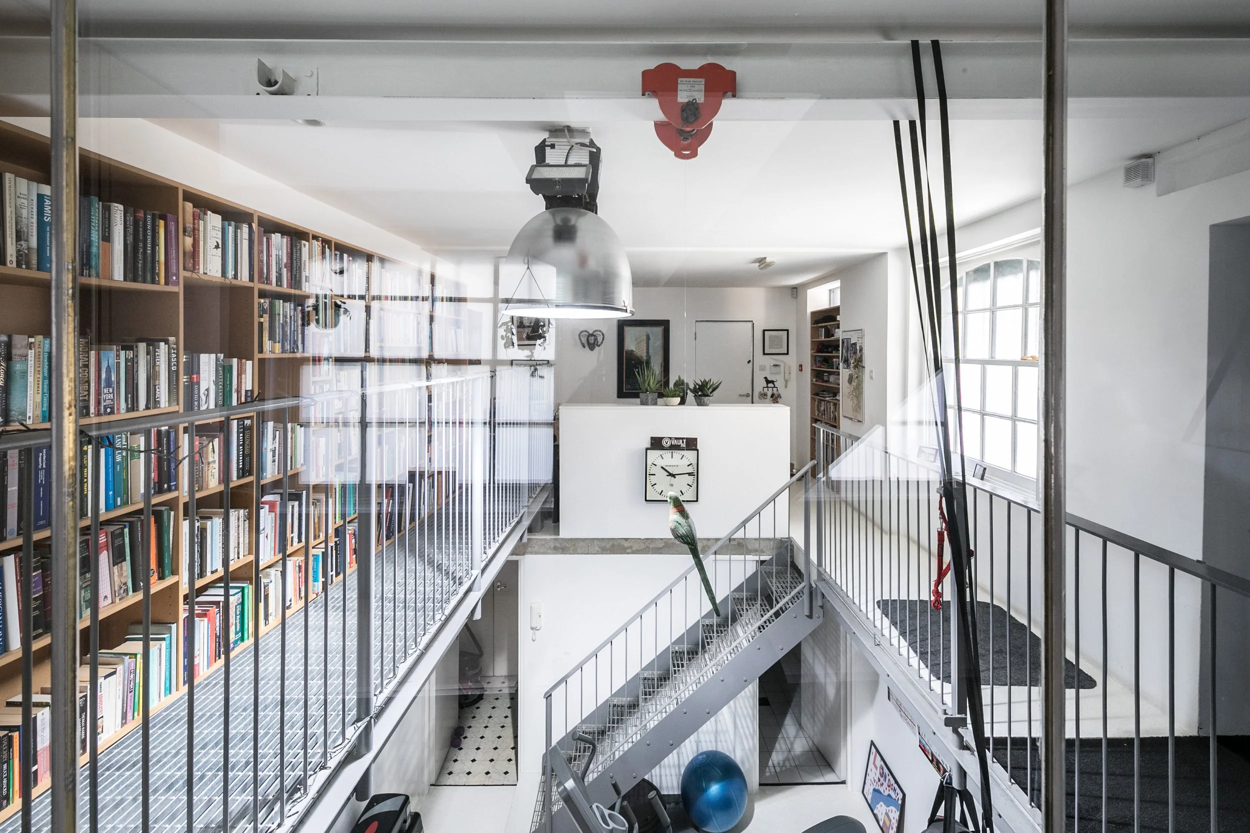
This is the house David Adjaye designed for me (he called it the Fog House, which I found very pretentious) and which we had a very public falling out over. I bought a brick Victorian warehouse building which had been a leather tanning factory, partly modernised and used as a studio by the artist Marc Quinn.
Adjaye added a glass top floor and rear extension, making it a house on five levels with two bedrooms and bathrooms. The top floor has a wonderful view over the churchyard behind which was worth all the misery of the building process. I got another architect (Ryder HKS) to add a library on a steel gantry on the ground level.
The bedroom has the same great view of the church. I should have put in a lift! It is designed to be secret from the outside, all the windows are frosted and it was painted a dark grey to reinforce its neutrality. Again, the planners weren’t very helpful and made us retain the side windows, which aren’t even old.
2. THE FITZROVIA CHAPEL, JOHN LOUGHBOROUGH PEARSON
Designed by John Loughborough Pearson 1891-2 with interiors by his son Frank Loughborough Pearson.
When I die, I do not want a funeral, you can burn me without any ceremony. I have left money for a big party for my friends (and enemies). I would love it to be held here, one of the most magical interiors in central London, a small chapel built in high Gothic style, with opulent shimmering gold interiors. It once stood in the courtyard of the Middlesex Hospital, which has been demolished, and a new development surrounds it- but the chapel more than holds its own. Every surface is carved or covered with mosaic, the floor is a patchwork quilt of colours and patterns. Not surprisingly, it has been used by pop stars and fashion designers as a backdrop- a hugely popular Alexander McQueen exhibition was shown here earlier this year. It is everything I want from a building- really sexy.
3. THE POCKET HOUSE, TIKARI WORKS
Designed by two architects who lived in it with their family, this is a brilliant example of using a small bit of leftover land and making a big impact. It’s on the site of two garages, and has a basement level with patio garden and two bedrooms. Because I’ve built two houses, and spent months looking for sites, I know the problems they would have faced. The solution is so elegant and airy. Not surprisingly, it was shortlisted for an RIBA award and Grand Designs house of the year. Most of the unused land in London- which really helps towards solving the housing crisis is small sites like this one.
4. ‘CHINESE’ GARAGE, EDMUND B CLARKE
Now a Tesco, having been a car showroom and a wine warehouse….this wonderful building would have made a great home. Like the Hoover building, it shows that humble workplaces or factories can result in buildings which are fantastical and heroic in their aspirations.
5. WESTMINSTER TUBE STATION
I love this interchange, and couldn’t wait to use it when the Jubilee line opened in 1999. Designed by Michael Hopkins and Partners. At the time, I was working in Canary Wharf, and the station there (designed by Sir Norman Foster) is equally inspiring. No one enjoys commuting to work, but even now, Westminster and Canary Wharf stations are still the most exciting places to pass through. As you slowly ride up and down the escalators, you become like an extra on a vast movie set- the sense of drama and excitement is huge.
Want to find out the opening times of the buildings and places in this collection, and the activities they are hosting? Click here!


